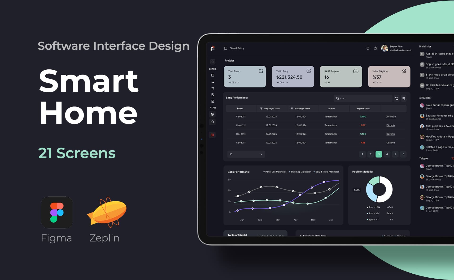
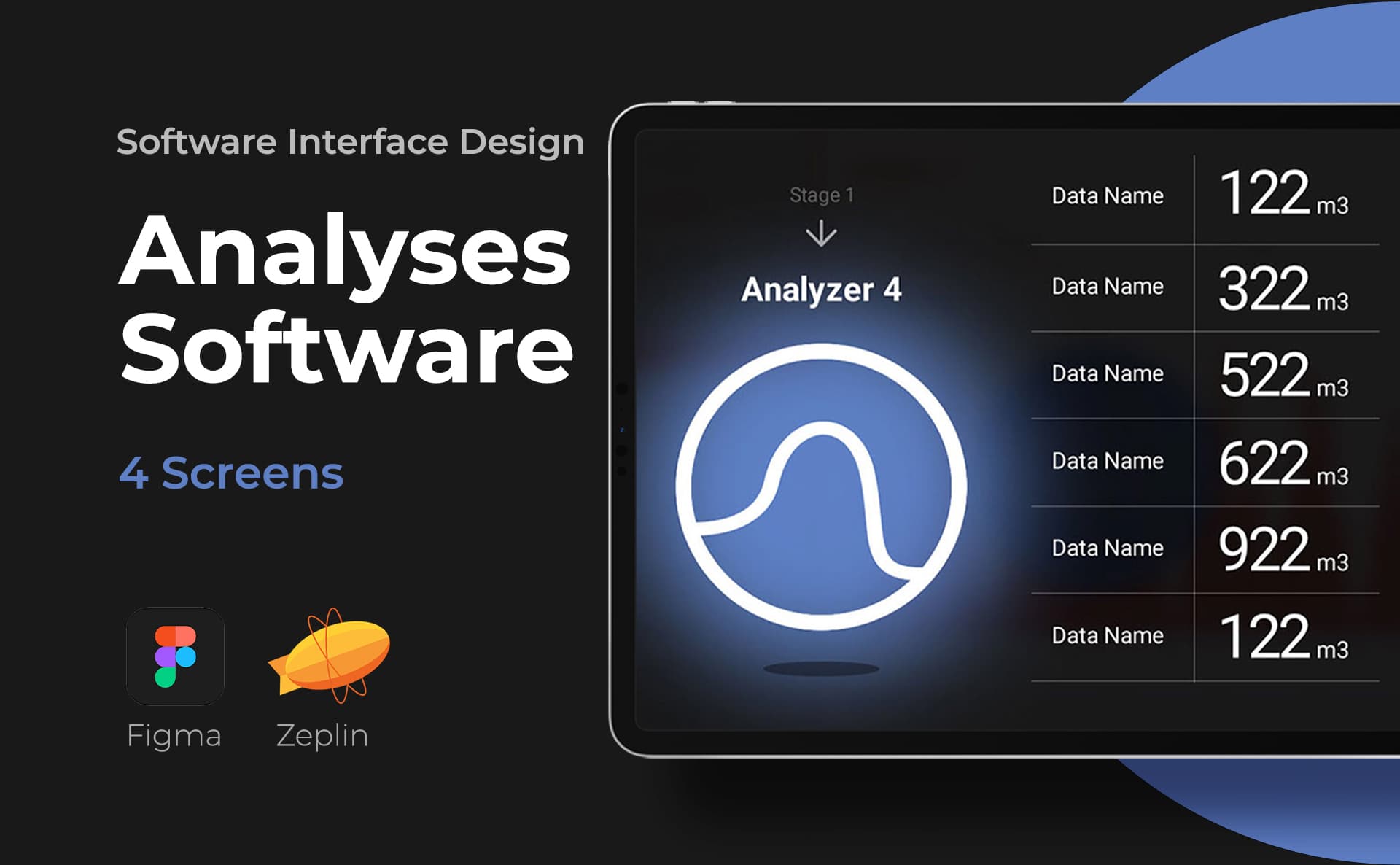
The SaaS dashboard should not only help the user see the data but also take the right action. I design dashboards, tables, filters and detail screens according to the user's role. While reducing data density, I am careful not to hide the information necessary for the decision.
Scope of the study
- Role and task based information hierarchy
- Table, filter, graph and detail screens
- Empty data, upload and authorization statuses
Design process
Preparation, design and delivery
First, I examine what decisions users make and the structure of the data. I design the basic tasks, check them at different data densities, and deliver them with the components.
Deliveries
- Figma panel displays
- Table and filter behaviors
- Role and status descriptions
Frequently asked questions
Should every data be represented with a graph?
No. A table may be more appropriate for an exact value comparison, and a graph may be more appropriate to see the trend. I choose the visualization type according to the question the user is looking for an answer to.
How is the scope of the proposal determined?
The number of roles, data types, filtering rules and the need for compatibility with the existing system affect the offer.
Let's determine the scope of the project together
The number of roles, data types, filtering rules and the need for compatibility with the existing system affect the offer.
SaaS product design: from first user to team use
SaaS product design for startups; handled with roles, authorizations, data tables and empty states. A new user may not understand a term known to the founder; Sample data may not be available at first account opening. For this reason, I also design startup and error scenarios instead of just a full dashboard view.
You can examine data priorities in the SaaS interface guide and the impact of roles and statuses on the offer scope in the startup budget guide.