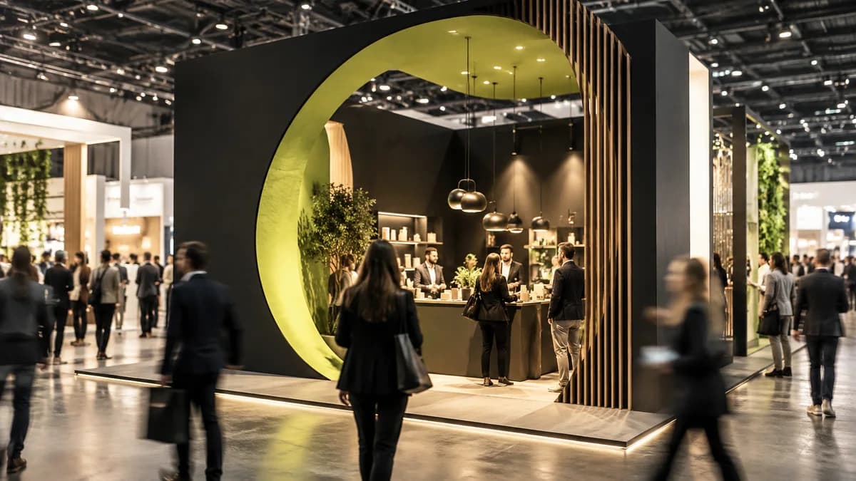
A trade show is one of the most intense battles for attention. While the visitor is passing through the corridor, he takes seconds to your stand and either stops or passes by during this time. That's why the first task of exhibition stand design is not beauty, but legibility from a distance and arousing curiosity.
What the stands that work have in common is simplicity and the use of height. A single strong message read from a distance, a clear brand identity and a clear layout that invites the visitor in; these are much more effective than crowded graphics. Light and material quality also directly determine the perceived value of the brand.
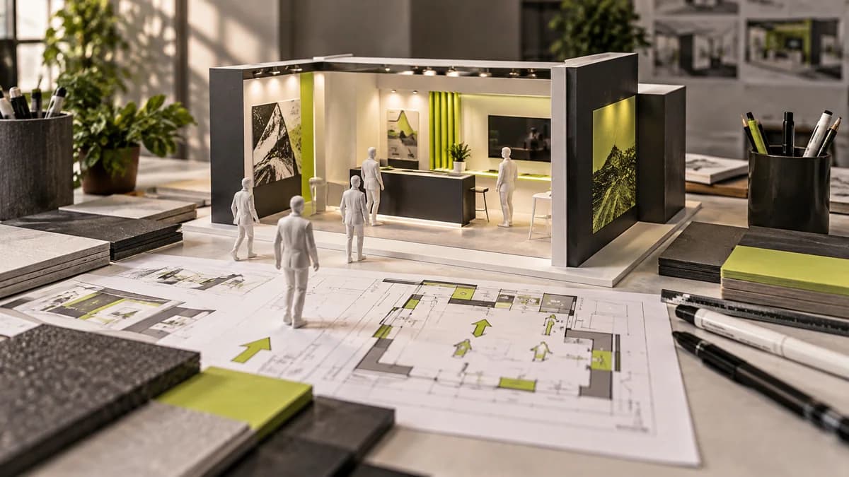
While designing the stand, I construct the visitor's journey: notice it from afar, understand it when you get closer, be convinced when you enter. A stand that does not consider these three stages will be lost in the crowd, no matter how big it is.
Frequently asked questions
Which message should be read from afar at the exhibition stand?
The text message that helps the visitor distinguish the brand and the core value you offer should stand out. Arrange detailed product descriptions on more closely examined surfaces.
How to evaluate stand graphics in a crowded fair environment?
Think not only in an empty model, but also with the approach direction, neighboring stands and equipment that blocks the view. See if the brand and main message are highlighted at different distances.