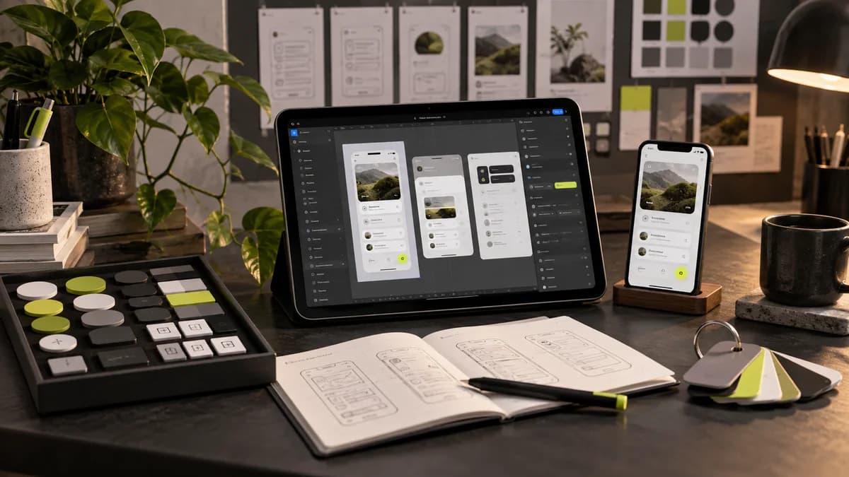
UX writing helps the user complete a task with short texts on the screen. Advertising slogan can attract attention; However, a payment error or file upload warning should provide concrete information. In Freelance UI UX design, text is part of the interaction, not filler placed in the spaces afterwards.
Describe the result of the button by its name
The wording “Continue” on a quote form is ambiguous. If the next step is to add files, “Add files” is more descriptive. If sending a transaction request, “Send quote request” is more descriptive. Free initial consultation and paid order should not be presented with the same word. The user must understand what decision they are making before clicking.
Separate the visual weight of the primary action and the secondary option. Using three equal buttons in the same area can make it difficult to decide, even if the text is good. In landing page design the advertising promise and the result of the button should be connected to the same flow.
Place the error message next to the solution
Instead of “Invalid login,” give a workable explanation, such as “Type the phone number with the area code.” The error should not be expressed only in red; Include text next to the relevant field. If there is a server problem, do not blame the user for typing incorrect information.
- Loading: report in progress, prevent resubmission.
- Success: describe what was recorded and the next step.
- Failed: specify the retry path and protected information.
- Empty list: explain that there is no data yet and offer a meaningful start.
Maintain understandability with brand voice
Even a sincere brand doesn't have to be playful about a critical mistake. Before calling the same action “save” on one screen and “confirm” on another, check to see if the actions are actually different. A concise glossary ensures that the designer, content manager, and developer use the same language.
While evaluating the interface design with Selçuk Aker, we can also examine how real text behaves on narrow screens. Form design guide completes how to bring this language into the application process.
Frequently asked questions
Is UX writing SEO text?
The priority is for the user to complete their task. Instead of stuffing keywords into a button, it is necessary to clearly explain the action.
Should every button be the same color?
Actions of the same level of importance should be consistent. Visual separation of different tasks such as delete, cancel, and main action should be considered.
Is shorter text always better?
No. Give the information needed for the decision in the most understandable way, instead of brevity that loses meaning.