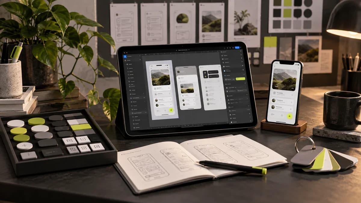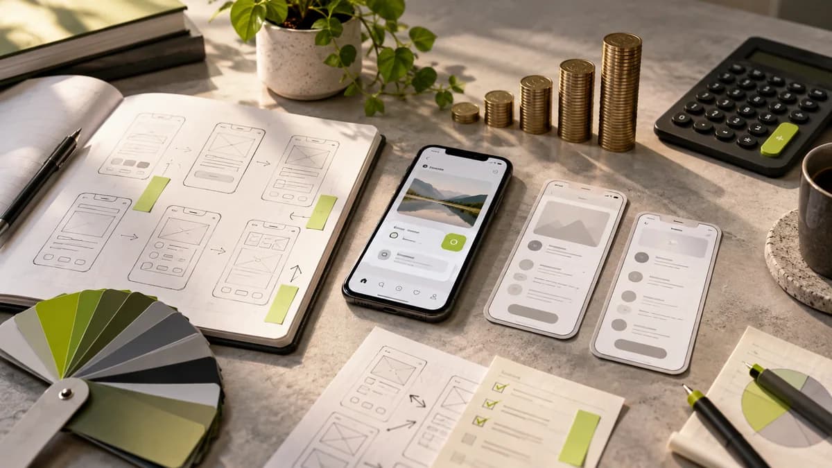
Responsive web design means that the page adapts to different screen widths. It is not enough to make the desktop design proportionately smaller. Reading order, navigation and interaction areas should be re-evaluated on the narrow screen. The aim is not only to prevent overflow, but also to enable the same task to be done on the phone.
What is the first need in mobile?
A person who comes to a service site may want to learn the scope or contact. Long introductions sitting side by side on the desktop can push the main information too far down on the phone. Instead of destroying the content, review the order and presentation format.
For example, in a catalog download area, the name of the file, its language, and the download link should remain visible. If a large decorative image gets in the way of this information, different cropping or a shorter area may be considered in the mobile layout.
Resolve menu and table separately
The long menu may need a drop-down structure accessible on a narrow screen. Opening and closing behavior, focus and page scrolling should be considered together. Check that fixed areas above the screen do not obscure the content.
Making each column smaller in a comparison table can make the text unreadable. Horizontal scrolling, summary view, or drill down options are considered depending on which columns will be compared together. The correct solution depends on the meaning of the data.
Where is the important part of the image?
When a horizontal image is cropped to a narrow area, the product or face may fall out of the frame. Determine the focal point for card and hero images. Embedding text within the image can also make readability and accessibility difficult on different screens.
Don't settle for just two screenshots
There are different widths between the small phone and the large desktop. Also check for long title, opened keyboard, and large text. Explain to the developer the reasons for breakpoints in the design file; Sending only two fixed measurements may not describe the behavior in between.
With Selçuk Aker, you can jointly determine the priority user tasks and content order in mobile web design.
Choose grid, video and gallery according to content
There is no single mandatory number of columns for every project. Cards, text and comparison areas can be arranged according to your own content needs. The order in which the columns on the widescreen will go on mobile is also part of the design decision.
Before using a video or scrolling image at launch, ask what information it conveys. Evaluate user control, text readability and loading impact. If there is a transition from small images to details in the product gallery, closing, returning and using the keyboard should also be considered. An animated presentation should not be the only way to access essential information.
Frequently asked questions
Does responsive design mean a separate mobile application?
No. It describes the adaptation of the page in the browser to different screens; The mobile application can be a separate product.
Is it okay to hide all desktop content on mobile?
Generally, the order and presentation of content should be evaluated first. Do not make the information the user needs inaccessible.
Is it enough to have no visual overflow?
No. Readability, interactivity, and task completion should also be checked.
What screens should you ask for when looking for a mobile web designer?
Instead of just making the desktop page smaller, the mobile web designer re-evaluates the priority of information on the narrow screen. Menu, tables, forms and product cards may require different behaviors. Use your actual content instead of short sample texts in design evaluation.
With mobile web design service Selçuk Aker we can plan how critical pages will work in different widths. Web designer guide helps you separate interface file and coding and publication delivery responsibilities.