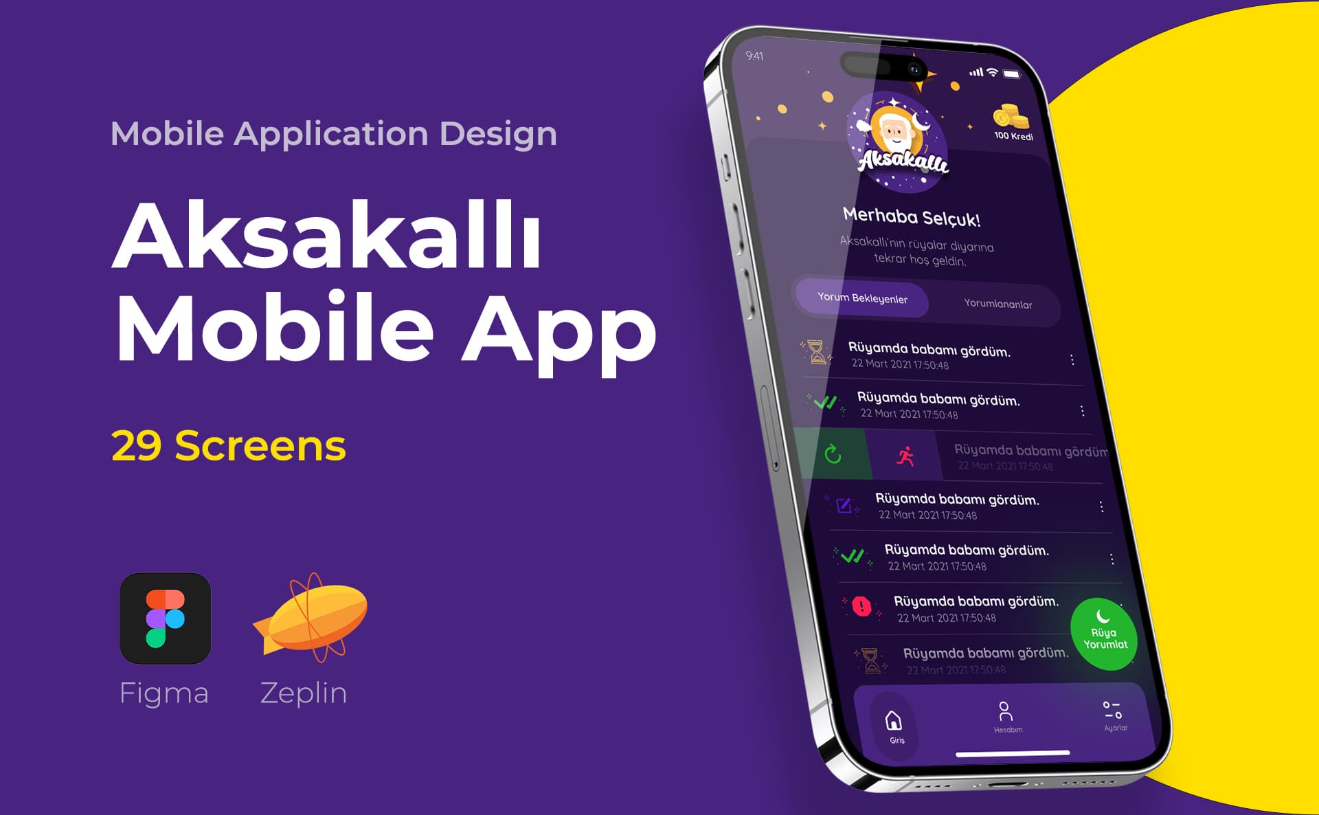
Mobile web design is more than just minimizing the desktop screen. I'm re-evaluating the content order, touch areas, menu and form usage on the narrow screen. I define at the design level that the site running in the browser behaves consistently across different widths.
Scope of the study
- Mobile content priority
- Menu, form and touch interactions
- Responsive breakdowns and component behaviors
Design process
Preparation, design and delivery
I start with the current site or desktop design and examine mobile tasks. I specify the behavior of critical templates at different widths and add developer notes.
Deliveries
- Mobile screen designs
- Responsive behavior explanations
- Form and navigation states
Frequently asked questions
Are mobile web and mobile application the same scope?
No. It is used via mobile web browser. Native application has different platform behaviors and development decisions; The need is handled separately accordingly.
How is the scope of the proposal determined?
Unique page templates, the state of the existing design, and the variety of interactions determine the scope.
Let's determine the scope of the project together
Unique page templates, the state of the existing design, and the variety of interactions determine the scope.