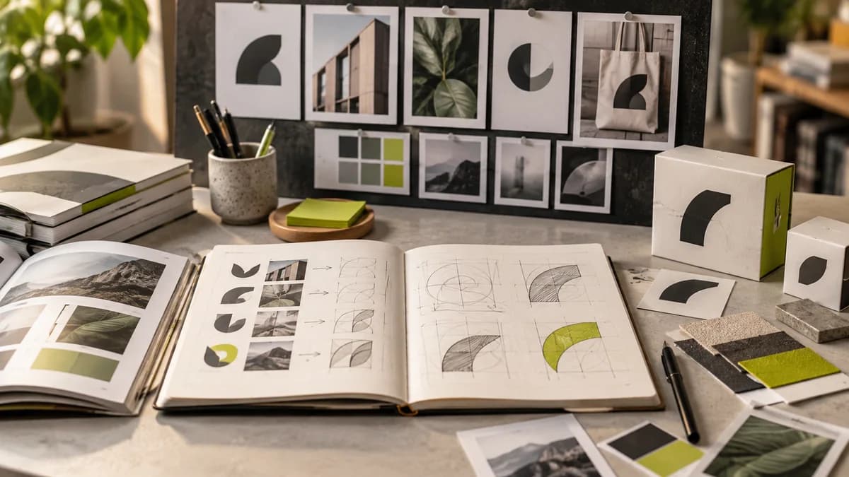
Seeing a logo large on a white background does not mean that it works well in daily use. When designing a logo, it is necessary to move the evaluation from the presentation visual to the surfaces that the brand will actually use. A small profile photo, solid color print and horizontal signage can reveal different weaknesses of the same design.
Read on a small scale first
Examine the logo on the phone screen as large as the profile icon. If thin lines are disappearing, letter spacing is blurred, or the symbol is blurred, simplification may be necessary. It is not necessary for every brand to use symbols; A readable text logo can also meet the need. The decision should be determined by the use of the symbol before personal taste for it.
Evaluate even without color
Ask for solid color and reverse use versions. With black and white output, laser marking or against a dark background, the logo must still be distinguishable. Rather than expecting the bright color on screen to look the same in print, clarify color correspondences and proofing needs with the manufacturer.
Match the delivery package to the application
Vector main file, images with transparent backgrounds, horizontal and vertical layouts meet different needs. Identify the files you will actually use rather than a bunch of formats you don't need. Font usage conditions and editable files should also be discussed at the proposal stage.
For example, for a brand using small product labels, reducing fine details may be a priority; In a brand with a wide store front, distance reading is more decisive. No single test can replace all forms of use. Seeing actual size samples before approving reduces the need to re-open the same job later.
Separate optical balance from geometric accuracy
Just because all parts of a logo are mathematically the same size does not guarantee that they will be perceived as having the same weight. When round, angular and oblique shapes come together, the relationship between space and weight can be re-evaluated visually. Therefore, do not conclude a "wrong logo" by measuring only with a ruler.
Examine it first in small and large sizes, then in one color and on different backgrounds. Show which correction improved readability or balance. When evaluating the logo designer Selçuk Aker, the actual result of use is more important than the geometric lines of the presentation.
Separate famous brand logo stories into verified sources and personal interpretations. Just because the meaning of a shape is repeated on the internet does not become the official description of the brand. Design trends guide helps separate seasonal taste from permanent identity decision.
Choose the logo type according to the brand name and usage
The text logo highlights the brand name; The letter abbreviation can present a long name in a compact form. Using an icon and text together may require separate placements for different areas. In the character or emblem approach, loss of detail on a small scale should be especially controlled.
These types are not rankings of success. Name length, brand awareness and application areas are decisive in the selection. In a new business, don't assume that the abstract symbol alone will be instantly recognizable to everyone. If necessary, the main version bearing the name and the auxiliary version for narrower areas are prepared together.
Instead of changing color, drawing and text decisions all at once, show which decision improves what. Logo files guide explains how to separate these approved versions on delivery.
Frequently asked questions
On what surfaces should I try the logo before approving it?
Try it on light, dark and, if necessary, photographic backgrounds suitable for your actual use. Also check the small size and single color version to spot readability issues before approval.
Why can a large image in a logo presentation be misleading?
Larger representation can make fine details stronger; the same details may be lost with minor use. Instead of making your decision based on presentation alone, examine separate examples in application dimensions.