Just because a design trend is popular doesn't mean it's suitable for every brand. The color of the year, a writing style, or a three-dimensional visual approach can provide new ideas; But this alone is not sufficient reason to change the brand identity. First determine what is obsolete and what need is unmet.
As art director Selçuk Aker, I propose to evaluate this decision together with the integrity of the brand. Trying a new visual language in a campaign is not the same as changing the logo that has been used for years.
Identify the trend, examine the feature, not the label
“Modern design” is a very vague description. Write down what has changed in the example you see: it could be wider letter spacing, fewer colors, a high-contrast photo, or a moving surface. Does this tangible feature work in the use of the brand?
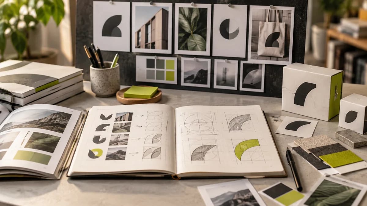
Add not only examples you like to your inspiration board, but also why they work. Describing the problem you want to solve instead of reproducing the same format makes it easier to find an original direction.
Do not think that Pantone selection is a brand rule
Pantone's color of the year program is not an instruction to change the brand palette every year. If you are going to use color, evaluate its relationship with the existing identity, target audience and production conditions. Verify current selection directly from Pantone; Changing the date of an old post is not a correct update.
Just because a color looks attractive on screen does not mean it will produce the same result on packaging material or in single color printing. Guide to evaluating brand color on screen and print should therefore be read alongside the trend verdict.
Separate permanent ID and temporary campaign space
The logo, basic colors and font family can be kept consistent for recognition. Photography direction, secondary colors and campaign compositions may be more suitable for controlled experiments. Specify in the brand guide which element may change.
For example, logo proportion and basic typography can be maintained while trying out a new color finish in an event campaign. This helps establish an up-to-date statement without looking like another brand with each new announcement.
Try three uses
Test the chosen direction on a small social media image, an information-dense page, and a physical application. A decision that is impressive only on a large presentation screen may not work in other areas. Actual size control is especially important for elements such as a pinstripe logo or extremely narrow type.
For the decision to change the design, answer these three questions: What improved? What did we lose? Can the team maintain this system? The scope of corporate identity design should be determined by these answers.
Frequently asked questions
Do I need to update my logo every year?
No. The need for change should be evaluated based on the business goal, usage problem, and brand recognition.
Is using a trend the same as copying a design?
Taking advantage of a common trend is different from remaking a specific design. Generate your own problem, content and application decisions.
Are old trend posts still useful?
Might be useful for historical comparison. Old suggestions should not be presented as current obligations.