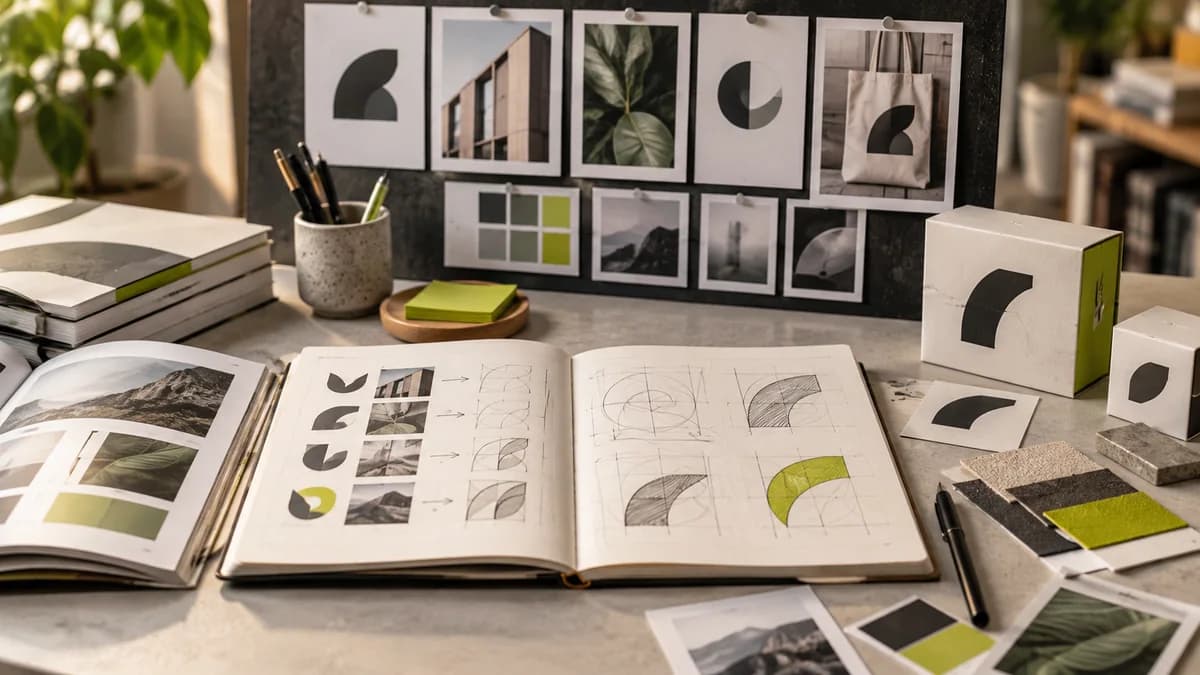
A logo is the smallest but most visible part of a brand. It has to work on the business card, the corner of the screen, the store sign, and the social media avatar all at the same time. That's why a good logo is not a decoration, it's an engineering job.
Logos that survive for years share five characteristics. Simplicity: memorable at first glance. Scalability: reads in both huge and tiny sizes. Memorability: once seen, recognized. Suitability: fits the character and industry of the brand. And timelessness: it leans not on a season's trend, but on the essence of the brand.
When designing a logo, my goal is to find the 'right' one, not the 'cool' one. Because the logo is not a work of art, but a working tool; It is the core of an identity that will live with the brand for years to come.
Frequently asked questions
When evaluating a good logo, do you only look at originality?
Along with originality, readability, scalability and usability should also be examined. An unconventional format alone isn't enough if it doesn't work in the brand's daily practices.
Why is the logo checked separately when using a single color?
It can be seen whether the shape is still distinguishable without color differences. If single color printing or similar usage needs are required, the appropriate version must be prepared at the design stage.