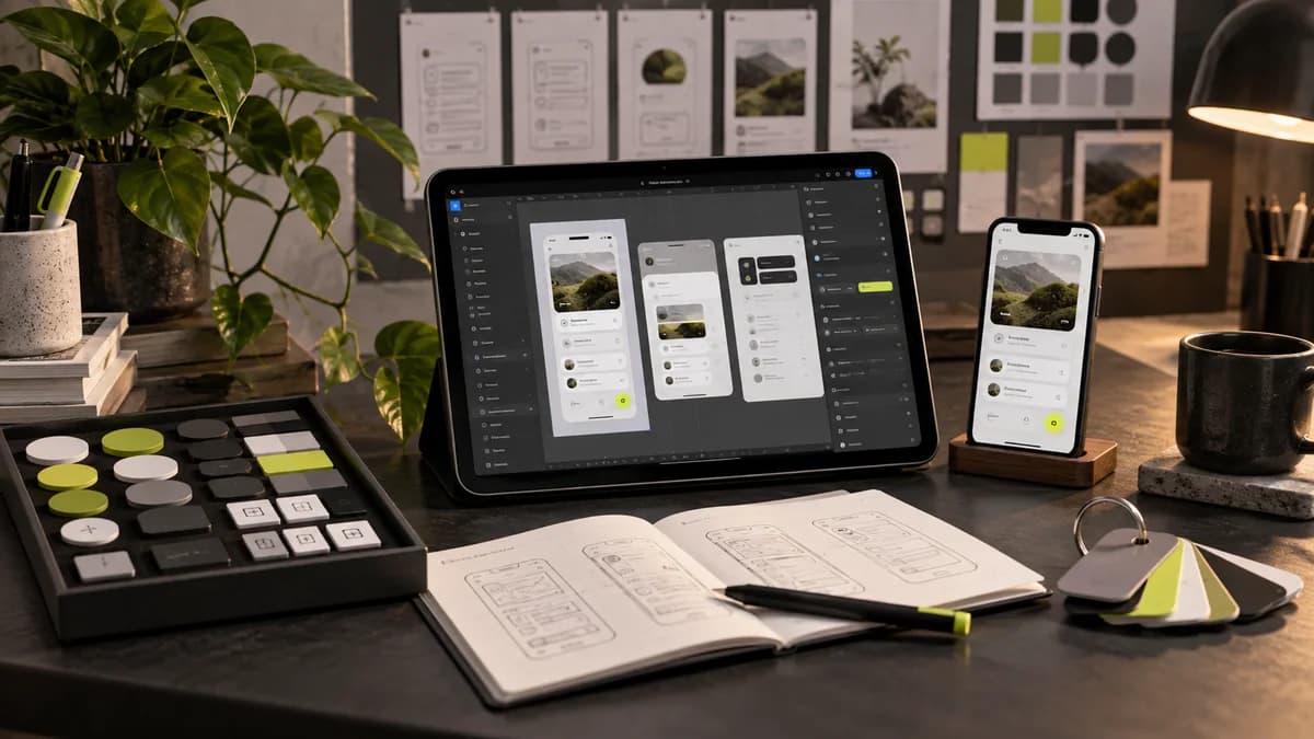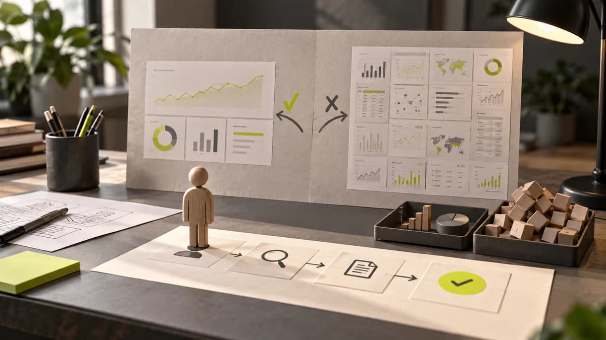
For the freelance interface designer, mobile table design is not just about minimizing the desktop table. The user may be just doing a status check while on the go, or may need an actual comparison. The right solution depends on which task to protect.
Identify the main work done on mobile
Seeing the status of an order and comparing the specifications of ten products are different needs. In the first case, summary cards may be sufficient; In the second one, it is necessary to preserve the row and column relationship. Don't automatically assume all information on the desktop is of equal importance.
Bind column priority to a visible rule
Identity, status and core values may remain in first view; details can be moved to additional space. Reducing information does not mean making information inaccessible. Plan how to access hidden columns and understand if there is horizontal scrolling. Sorting and filter controls should also be compatible with the mobile domain.
Separate action from detail opening
Tapping the entire row can open a small field action menu when opening details. If these behaviors are mixed, wrong choices increase. Prepare examples with realistic long names, large numbers and different situations. Also consider empty result and selected row states on mobile.
Brief check before delivery
- Is the main task on mobile defined?
- Are the priority columns and detail path clear?
- Is there a difference between opening a line and selecting a transaction?
Clarify scope with Selçuk Aker
While working with Selçuk Aker, you can evaluate these decisions within the scope of SaaS and dashboard design. For the first meeting, share existing files, usage environment, and target delivery date. User task in dashboard design completes this preparation.
Frequently asked questions
Should every table be converted to cards?
No. If comparison between records is required, a solution that preserves the table relationship may be more appropriate.
Is horizontal scrolling a bad solution?
It is not bad by itself. Scrollability should be understood and the user should not lose sight of which record they are viewing.
Can fewer features be offered on mobile?
Prioritization can be done by preserving the main tasks. The missing functions should not leave the user in an incomplete flow.