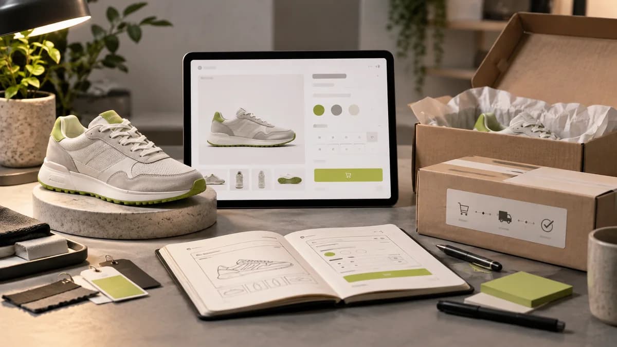
A product page should simultaneously enable the customer to view the product and understand the terms of purchase. A nice product photo; It does not alone answer the questions of size, compatibility, delivery or variant. In e-commerce interface design, where and in what order this information is displayed is decisive.
Make variants selectable
Color, size and capacity options should be associated with the actual stock status of the product. It must be understood why an option cannot be used; The user should not be kept waiting until the payment step. It should also be checked whether the image represents the selected variant. While a small color label is sufficient for some products, separate photos may be required for different packaging or size.
Move decision information closer to the purchasing area
Delivery conditions, measurement guide and important product features should be easily accessible to the person looking for them. Group all the information by usage question instead of saving it for the end of a long description. Compatibility information for technical products and size and fabric information for clothing may come to the fore.
Design after adding to cart
It should be visible that the operation was successful, the quantity of the selected product and the next step. In case of incorrect quantity or depleted stock, the user should be able to continue without losing their selections. The panel opened on mobile should not block important buttons of the page or the keyboard.
Conduct a design review with a real product family: product with a long name, product with multiple variants, and out-of-stock product. A display prepared with a single ideal example can hide the needs of the rest of the catalogue. Considering the product viewing, option selection and adding to cart steps in measurement separately makes it easier to understand the location of the problem.
Separate payment interface with virtual POS integration
Virtual POS is one of the solutions used in accepting online card payments; Adding a payment image to the product page does not mean the integration is complete. Provider selection, technical connection and transaction rules are evaluated with the relevant teams. The designer prepares the screens where the user will understand the amount, transaction status and next step.
Do not show payment pending, failed, or completed statuses with the same message. When the connection is lost it should be clear what the user will check before restarting the process. Do not fill card and personal information with real customer data in design experiments; Use sample data.
Product photos, interface design, software and payment service may be separate items in the budget of an e-commerce project. E-commerce design price guide explains the screen scope, API states guide explains the necessary screens during data communication.
Support trustmarks with shopping information
Ensuring that the product image represents reality, seller communication, and understanding the total cost are all part of the decision. Unexpected fees or unclear delivery information at checkout can undermine a good-looking product page. Adding a trust badge does not address this knowledge gap.
While evaluating the payment infrastructure, the technical team and the business; Reviews supported methods, costs, transaction statuses, and refund processing. On the design side, the wait, failed transaction and retry flows need to be understood. Do not direct the user to make the same payment again due to uncertainty. Form and results screen guide describes how to handle similar situations.
Frequently asked questions
How to make variant selection clear on the product page?
Show color, size or model options with clear names; Separate selected, unavailable, and not yet selected states. Consistently state how price and image change based on selection.
What should the user see after adding to cart?
It should be understood whether the process was successful or not and which product was added. The user should be able to find the options to continue shopping or go to the cart; should not be left with an unclear button response.
Examine the product flow when choosing an e-commerce designer
When looking for an e-commerce designer, do not only evaluate the campaign area of the home page. Product card, variety selection, stock information, basket and pre-payment explanations are parts of the same shopping flow. Also see examples such as long product name, nonexistent variant, and empty result.
In e-commerce site design service we can start with your existing infrastructure and product structure. As Selçuk Aker, I design the visual interface and user flow; Payment integration or infrastructure setup should be specified as a separate responsibility. Web designer selection guide helps you compare file and application scope.

