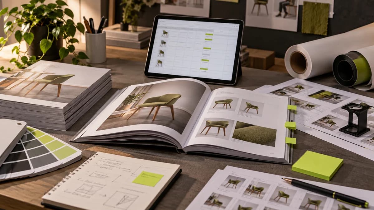
A brochure is a material designed for short contact; the reader devotes seconds to it, not minutes. That's why the most important decision for a brochure is not how much content it has, but how clear it is. One main message, a few pieces of evidence to support it, and a clear next step—that's the skeleton of a good brochure.
The logic of folding is the backbone of the design: each fold should prepare the reader for the next information when opened. There is curiosity on the cover, explanation on the inside, and communication and call on the back. When the visual-text balance is off, the brochure feels either empty or overwhelming.
My goal when designing a corporate brochure is this: If someone takes it off the table and looks at it for three seconds, they will understand what you do and why they should talk to you.
Frequently asked questions
Is it a strict rule that the message in the brochure can be understood in three seconds?
No, such durations are not fixed measures valid for every context. The important thing is to find the main message quickly; Test according to deployment location, viewing condition and reader's need.
What information should stand out on the first side of the corporate brochure?
It should be clear what you are offering to whom and why the reader should continue. Focus on the main proposition and the next step, rather than trying to fit the entire history of the organization onto the first surface.