The most easily overlooked issue when designing a poster with artificial intelligence is the reading of the poster. A detailed image can overshadow the headline and information that conveys the message. Even if the tool can produce accurate text, the order of importance, placement and usage distance should be evaluated separately.
Select the first message of the banner
The poster for a student exhibition cannot include the event name, date, location, participants and sponsors at the same time. First determine what the viewer needs to notice. Then group other information according to this decision. Zooming in on the design is a practical way to see if each element is screaming with the same force.
Don't lose the text within the image
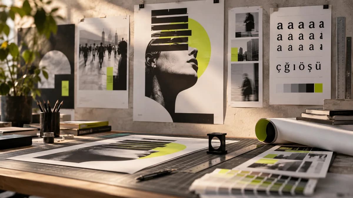
Whenever possible, keep the final text on a separate, editable layer. This way you don't have to reproduce the entire image when the date changes. Compare Turkish characters, person names, address and punctuation with the source text. It's not enough to have the words right either: improper line breaks and poor contrast can make reading difficult.
Why does actual usage measure matter?
A banner zoomed in on a phone screen does not represent the print that will be seen from afar in the hallway. Read important information from the targeted distance. Talk to the printing house about measurements, bleeds and file expectations. Do not accept a generic “print setting” list from the Internet as valid for every manufacturer.
Two-version trial for students
Prepare a version of the same poster with a larger image and smaller information. Bring forward the event name and date in the second version. Instead of evaluating two designs side by side, show them briefly in turn. Write down information that the viewer remembers. This exercise doesn't give you a single correct template; It allows you to see the impact of your decision.
What should you expect in professional poster work?
The graphic designer organizes the message, establishes the relationship between text and visuals, and adapts to different sizes. If an artificial intelligence image is to be used, its suitability for the entire poster is also checked. Rather than printing the raw output directly, request a file with complete information and production checks.
You can examine the scope of Poster design; For digital adaptations, you can check out social media design.
For an overview, you can refer to the beginner's guide on designing with artificial intelligence.
Frequently asked questions
Should the text on the artificial intelligence poster be checked separately?
Yes. Letters, Turkish characters, date, location and contact information must be verified one by one. Placing text as editable makes last-minute content corrections more manageable.
Why might an AI banner that looks good on screen cause problems in print?
Image resolution, small texts and production size may not be noticeable on the screen. Check the final file with the actual size, viewing distance and technical conditions of the printing house.