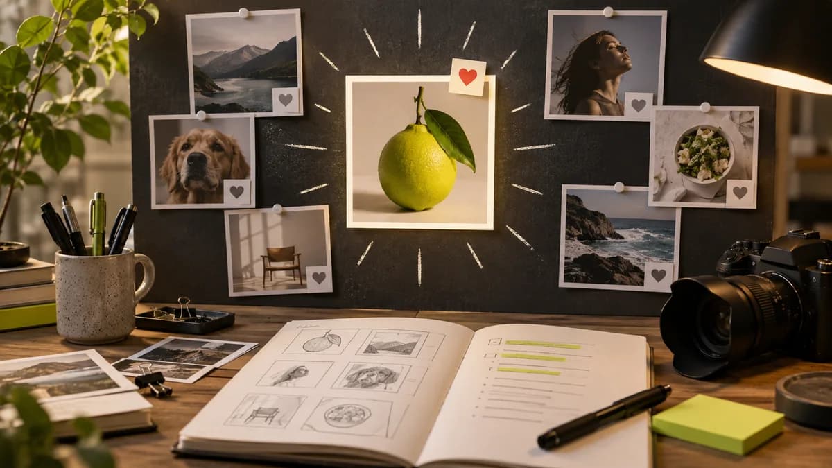
Pausing an image in an infinitely scrolling stream takes under a second. What featured posts have in common is surprisingly simple: a clear focal point, strong contrast, and a message that's read at a glance.
Crowded visuals lose out. The more a frame tries to tell, the less it tells. The best social media designs magnify a single idea; It leaves the rest to the work of the text or the next frame.
There is also the 'mobile first' reality: when designing your image, it is necessary to assume that it will be viewed on a small screen, with low attention and silence. Design that works small works everywhere.
Frequently asked questions
Is bright color the most important thing in an eye-catching social media image?
Color can attract attention; However, the message must also be understood and compatible with the content. Brightness alone is not enough without strong focus, readable text and the right context.
Is it right to evaluate social media design by the number of likes?
Likes are a signal, it does not show the whole result. Depending on the purpose of sharing, consider other outcomes such as access to information, relevant questions or applications; separate design impact from other factors.


