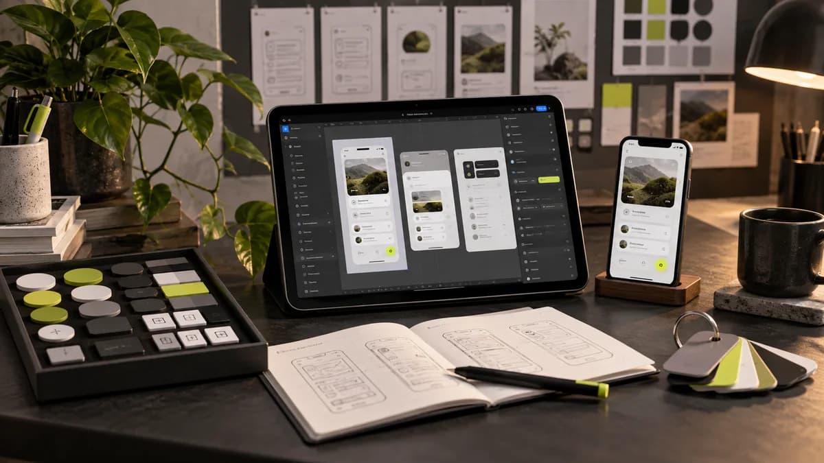
The design system doesn't just consist of buttons with the same appearance. It also describes where a component will be used, what states it has, and which screens it will affect when it changes. Instead of making library size a measure of success, it is more useful to look at how much the team reduces repetitive decisions.
Design situations together
The empty, full, focused, error, and disabled states of a form field meet different needs. The location and length of the error message should be considered as well as the successful display. Behaviors such as whether the button can be re-clicked during loading should be clearly discussed between design and development.
Associate names with intended use
Specifying a color token's role rather than naming it by its visible color alone makes it easier to manage theme and product changes. Text, surface, border and status colors should not mix with each other. The same principle applies to spacing, corners, and typography decisions. Unnecessary variants can make the library difficult to use.
Rehearse delivery with a real screen
Ask the developer or secondary designer to prepare a screen with existing components. If it needs to constantly create duplicate components, the system may not meet the needs sufficiently. Having a use case, counterexample, and behavior note in the documentation is helpful at this stage.
Finally, determine the change principal and release announcement method. Do not assume that an update to the library automatically rolls over to the product code. Even a well-organized Figma file can detract from the application over time if the differences between the design file and the working interface are not kept track of.
Frequently asked questions
Are only component drawings sufficient for design system delivery?
The intended use of the components, their status, content rules and examples are also required. If the team cannot understand which component to choose in which situation, the visual library alone is not enough.
How can we test that a design system works?
Try installing a real content display with the components of the system. Note any missing cases, conflicting rules, and ambiguous names and correct them before submission.
Ask for use case when choosing a design system expert
The design system designer must describe the usage rules as well as the appearance of the components. It should be understood upon delivery in which state the button will be selected, how the form error will be displayed, and what the component will do on the narrow screen. A large number of drawn parts alone do not constitute a usable system.
With Selçuk Aker we can plan the design system design starting from the recurring needs of your existing product. If the software component library will be developed separately, the name, status and release order must be matched with the developer. UI designer guide explains the relationship of display and component delivery.