Client and sector
Yılmaz İnşaat is a construction company. The counter on its website includes the phrase "1997'den bugüne" (since 1997). The site lists seven areas of activity. Buildings, infrastructure, power plants and water structures are among them. The same page lists YEO, YEO Solar and ISS as group companies.
The brief
The catalogue presents the company's completed projects one after another. The cover reads "güvenle 20 yıl..." (20 years of trust...), and the "20 yıl" (20 years) emblem recurs on the inside pages. The project pages run to at least page 89. This many projects had to be presented with the same information layout.
My role and scope
I designed the corporate catalogue for Yılmaz İnşaat.
Process and design decisions
- Format and colour: I set up the catalogue in landscape format. The main colour is olive green, accompanied by white and grey.
- Cover: On a white background there are fine olive-toned technical drawing lines. The drawing shows grid axis circles (A–D) and dimension lines (4.00, 12.00). The logo is on the left. In the top right there is an italic line: "güvenle 20 yıl..." (20 years of trust...). In the bottom right, a circle carrying the logo is connected to the drawing by a thick line.
- Back cover: On an olive background, the same drawing repeats in white lines. The "Güvenle 20 yıl" (20 years of trust) emblem is in the centre. The address and contact details are along the bottom edge.
- Kurumsal Duruş (Corporate Stance, pp. 10–11): The vision text is in a grey block and the mission text in an olive band. The 20-year emblem sits at the right end of the band. Below it is a photograph of a steel structure.
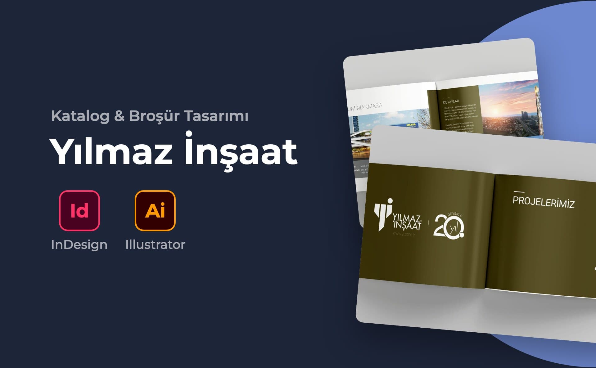
- Divider: The "Projelerimiz" (Our Projects) spread is olive from edge to edge. On the left are the logo and the 20-year emblem, on the right the heading and an arrow.
- Project template: Each project takes up a spread. The left page has a large, light-weight heading with a wide photograph below it. The project year is in the olive square at the bottom left. In the grey band beside it, "İşveren" (Client), "İşin Tanımı" (Scope of Work) and "Yer" (Location) are listed. On the right page, an olive "Detaylar" (Details) box describes the work carried out. Next to the box is a large photograph. Some projects have three small photographs at the bottom showing construction stages.
- Sample pages: Anatolium Marmara (2017, Kartal, pp. 18–19) and Melen Çayı Arıtma Tesisi (2002, Sakarya, pp. 88–89) were laid out with the same template.
- Footer: The page number is in an olive square, with the web address next to it. A small logo sits in the top corner.
Deliverables
Pieces shown in the gallery:
- Front and back cover
- Kurumsal Duruş (Corporate Stance) pages
- "Projelerimiz" (Our Projects) divider page
- Project spread template and project pages
Outcome
The visuals were prepared on mockups. There are no photos of the printed piece or of it in use.
This project is an example of my catalogue design service.