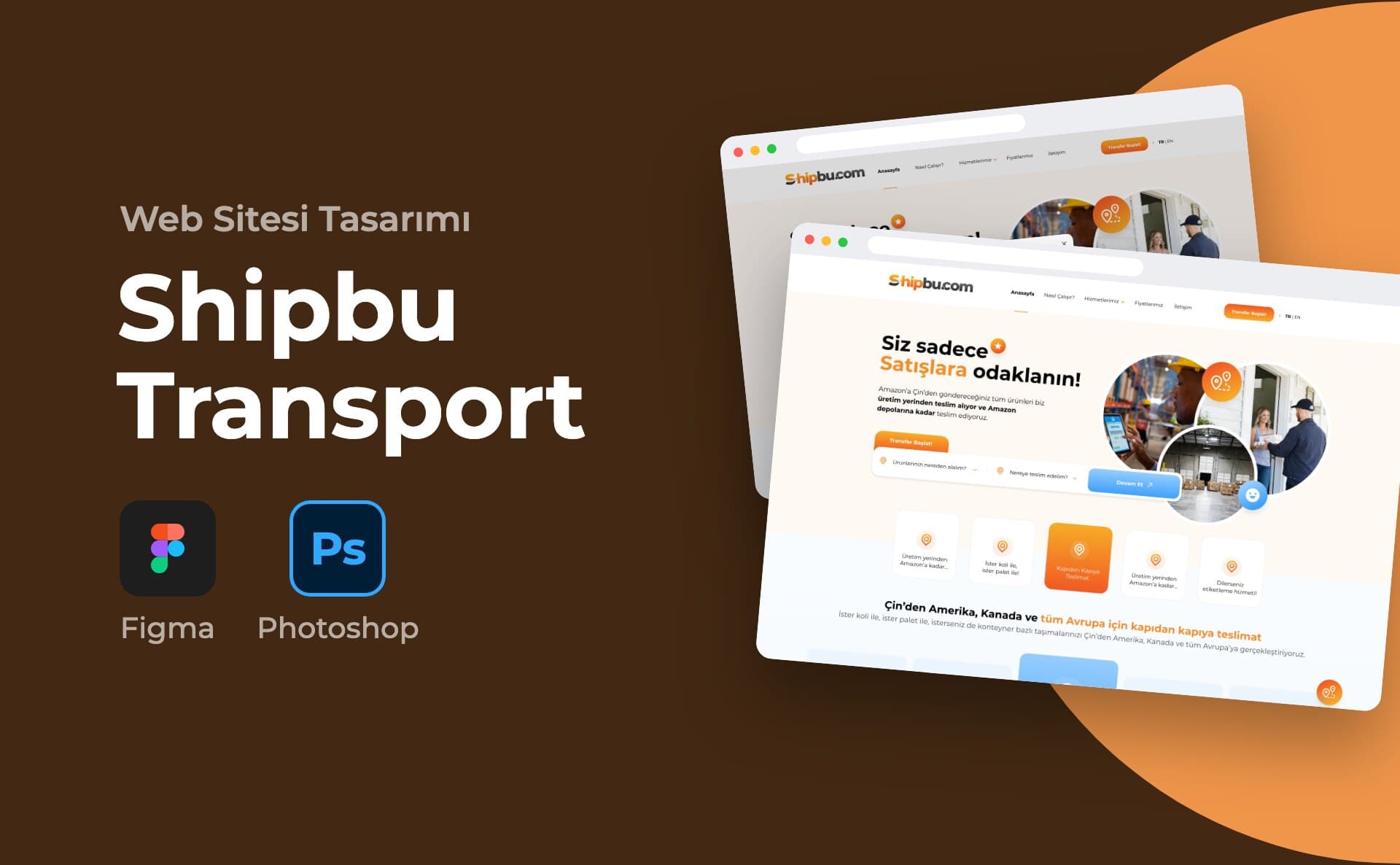
Client and sector
Shipbu is a logistics service for Amazon sellers. According to the copy in the design, it collects products from the manufacturer in China. It handles inspection, labelling and customs. It then delivers the products to Amazon's warehouses in the US, Canada and Europe. The company has an office in the US and a warehouse in China.
The brief
The first questions on a seller's mind are simple: Where will you pick up my product? Where will you take it? How much will it cost? The site needed to answer these questions quickly and collect the transfer request.
My role and scope
I designed the site's interface. I prepared the screens in Figma and handed them off with Zeplin. The portfolio includes 8 screens.
Process and design decisions
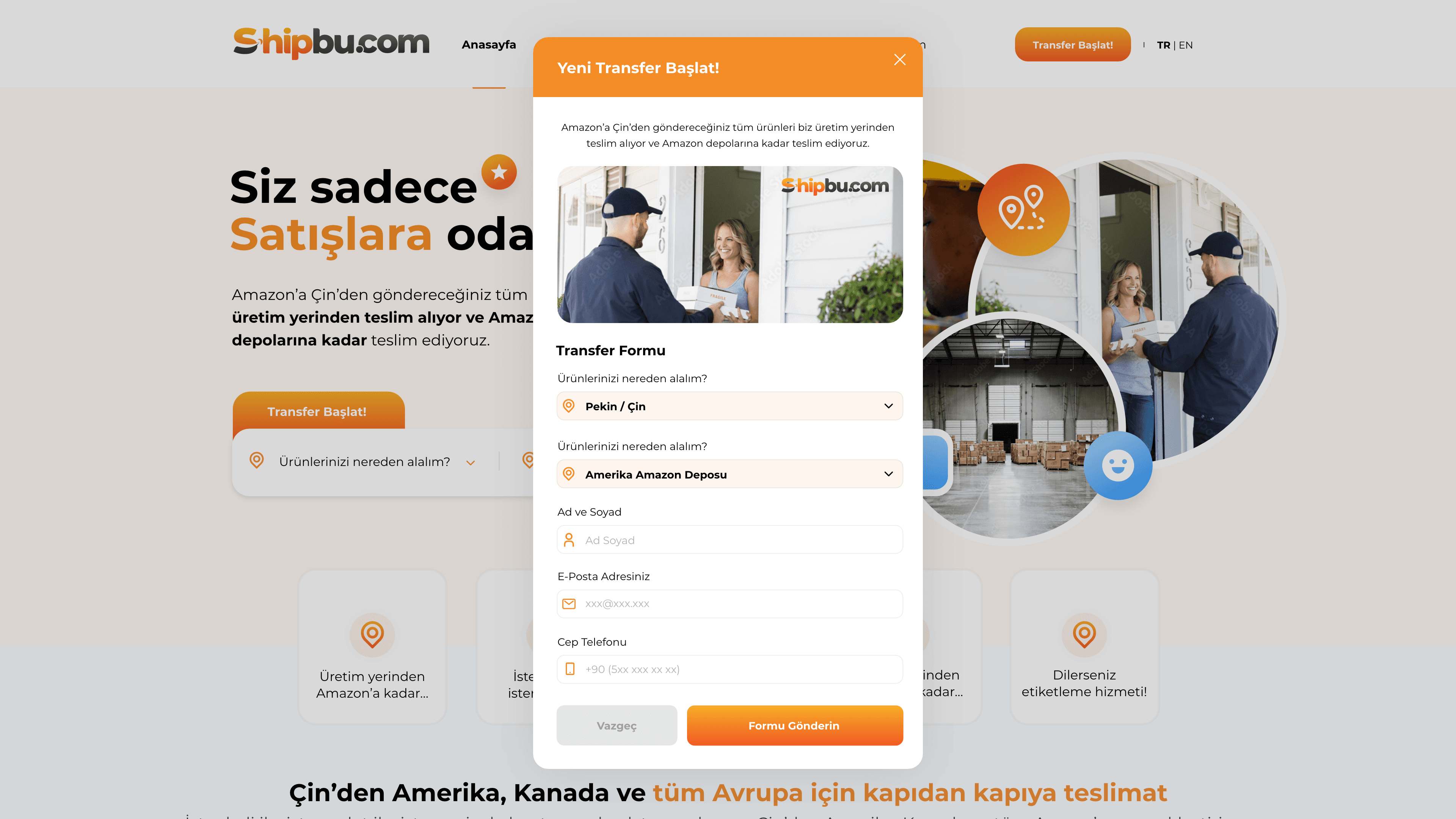
The homepage headline became "Siz sadece satışlara odaklanın!" (You just focus on sales!). Right below the headline I placed a two-field search bar. The first field asks "Ürünlerinizi nereden alalım?" (Where should we pick up your products?). The second asks "Nereye teslim edelim?" (Where should we deliver?). When the user clicks Devam Et (Continue), a transfer form opens. The form arrives with these two choices already filled in. The user only types their name, email and phone number. On submitting, a "Talebinizi aldık" (We have received your request) window appears.
I explained the service process with a five-step diagram:
- Product pickup
- Product inspection
- Labelling
- Customs procedures
- Delivery to warehouses
I drew the steps with icons in speech-bubble form. On the How It Works page I listed the same steps vertically with their descriptions.
The Prices page has two tabs, for the US and Canada. In the table, prices are broken down by shipping method, region and weight range. The Contact page has US Office and China Warehouse tabs. Each tab includes an address, a map and a form.
The primary colour is orange and the secondary colour is light blue. I gave the header area of each inner page its own pastel colour: mint green for prices, lilac for services and peach for contact. The How It Works page is light blue. The footer is black. The menu has a Turkish and English language switch. A fixed button with a location icon sits at the bottom right.
On the homepage I designed a black band for key figures. The band has fields for registered customers, agreements, packages delivered and happy customers. Below it is a three-step benefits section.
Deliverables
- Home page
- Transfer request form (pop-up)
- Request confirmation window
- Our Prices page
- Our Services page
- How It Works page
- Contact page (US Office and China Warehouse tabs)
Outcome
The portfolio shows 8 screens from the site.
This project is an example of my website design service.