Client and sector
Ayes Rent A Car is a car rental company founded in Ankara in 2009. It has branches at airports and in city centres.
The brief
Users needed to be able to choose the pick-up location, drop-off location and dates from their phone. They needed to compare cars and see the rental terms. They also needed to complete payment within the app.
My role and scope
I designed the interface of the mobile app. I prepared the screens in Figma and delivered them via Zeplin. The portfolio contains 40 screens.
Process and design decisions
I built the rental flow step by step:
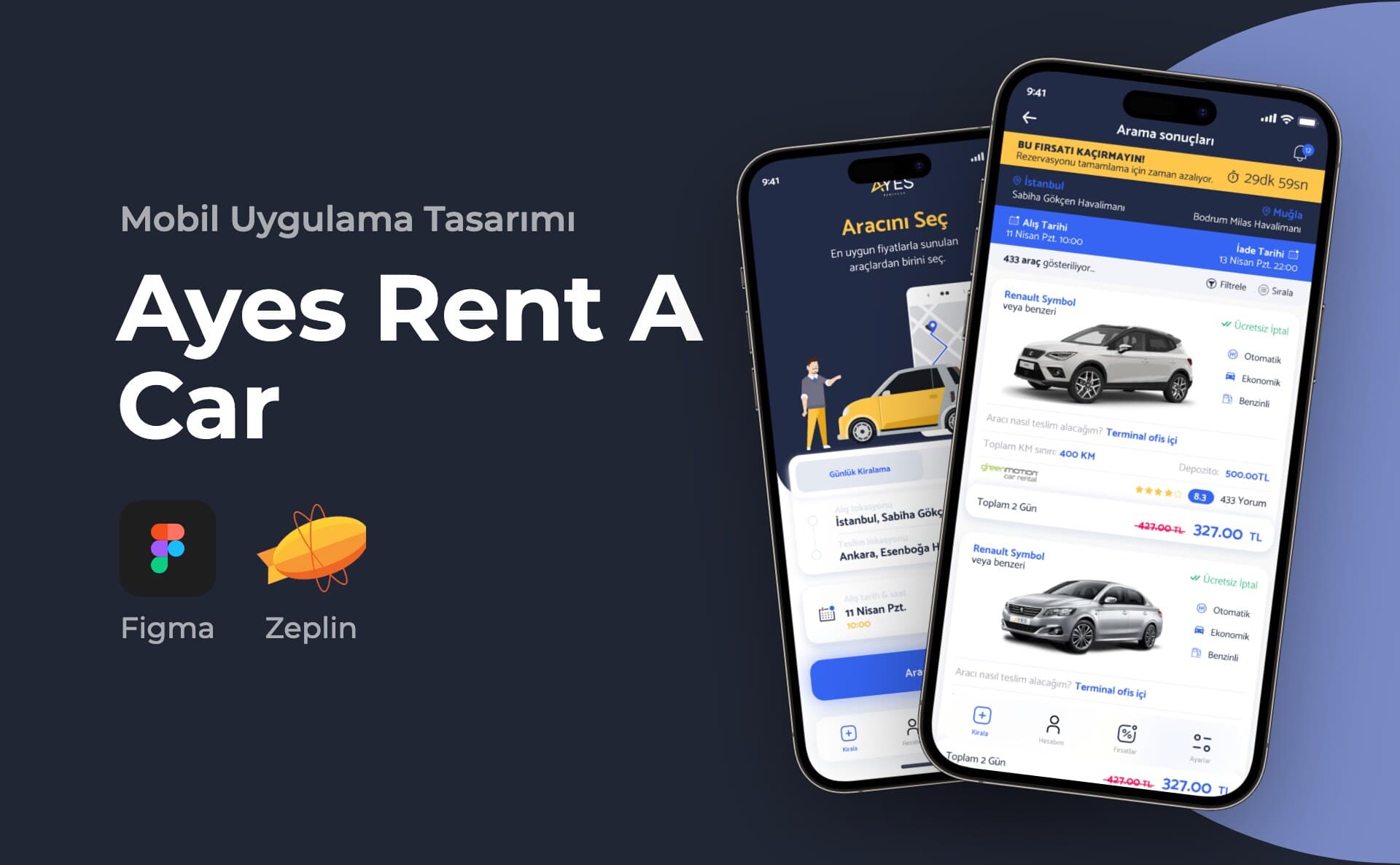
- The home screen has two tabs, for daily and monthly rentals. Below them are the pick-up and drop-off locations and two date cards.
- In the location search, results are separated with "Havaalanı" (Airport) and "Semt" (District) labels.
- For dates, I designed a two-month calendar. The time picker opens from the bottom.
- A loading screen appears during the search.
- The results list shows the number of cars found. Filter and sort options are in two bottom sheets.
- The filter includes price range, transmission, fuel, delivery method and make.
- On the car detail screen, the deposit, damage insurance and daily mileage limit are shown in three boxes. Minimum driver age and years of holding a licence are in a separate section.
- The payment screen has card details, a promo code field and agreement checkboxes.
- After payment, a confirmation screen shows the order code.
Above the result screens, I placed a countdown bar showing the time left to complete the reservation.
The account section brings together reservations, saved drivers and membership details. The help screen is here too. Campaigns are listed under the Deals tab. Users can send a campaign to a friend by email. In the notification settings, email, SMS and in-app notifications can each be switched on and off separately.
I designed onboarding screens for the first launch. Three of them are in the portfolio. Users can also continue without signing up. Error screens, loading screens and positive or negative notification boxes are also part of the design.
I also designed a second, green-accented view. This view greets the user with "Bayi Adı" (Dealer Name). The reservation screen includes counters for total, active and cancelled reservations, along with a balance box. The reservation detail shows branch and contact person information and print buttons.
In the visual language, the top areas are navy and the headings yellow. The primary buttons are blue. On the onboarding screens, I used yellow and orange car illustrations. The bottom menu has four tabs: Kirala (Rent), Hesabım (My Account), Fırsatlar (Deals) and Ayarlar (Settings).
Deliverables
- Onboarding screens (3)
- Login, sign-up and registration confirmation
- Home screen, location search, calendar and time selection
- Search results, filter and sorting
- Car detail
- Payment, promo code and order confirmation
- Reservations and reservation detail
- My Account, notifications and notification settings
- Deals and campaign sharing
- Help and FAQ
- Error, loading and notification states
- Second, green-accented view
Outcome
The portfolio shows 40 screens from the app.
This project is an example of my mobile app design service.