Client and sector
Perde Lazım is the online store of the curtain brand Brillant. The homepage I designed also carries the line "perdelazim.com Brillant resmi satış sitesidir" (perdelazim.com is Brillant's official sales site). The site has categories for sheer, zebra, roller, drape and vertical curtains. The dates and footer on the screens show the year 2021.
The brief
The site's promise is stated in the homepage copy: book an appointment with a dealer to see the chosen curtain up close and buy it. So the site had to offer two paths side by side: one for ordering online, the other for booking a dealer appointment. Dealers also needed their own entry point to the site. After an order, the tracking, cancellation and return steps had to run without wearing the user out.
My role and scope
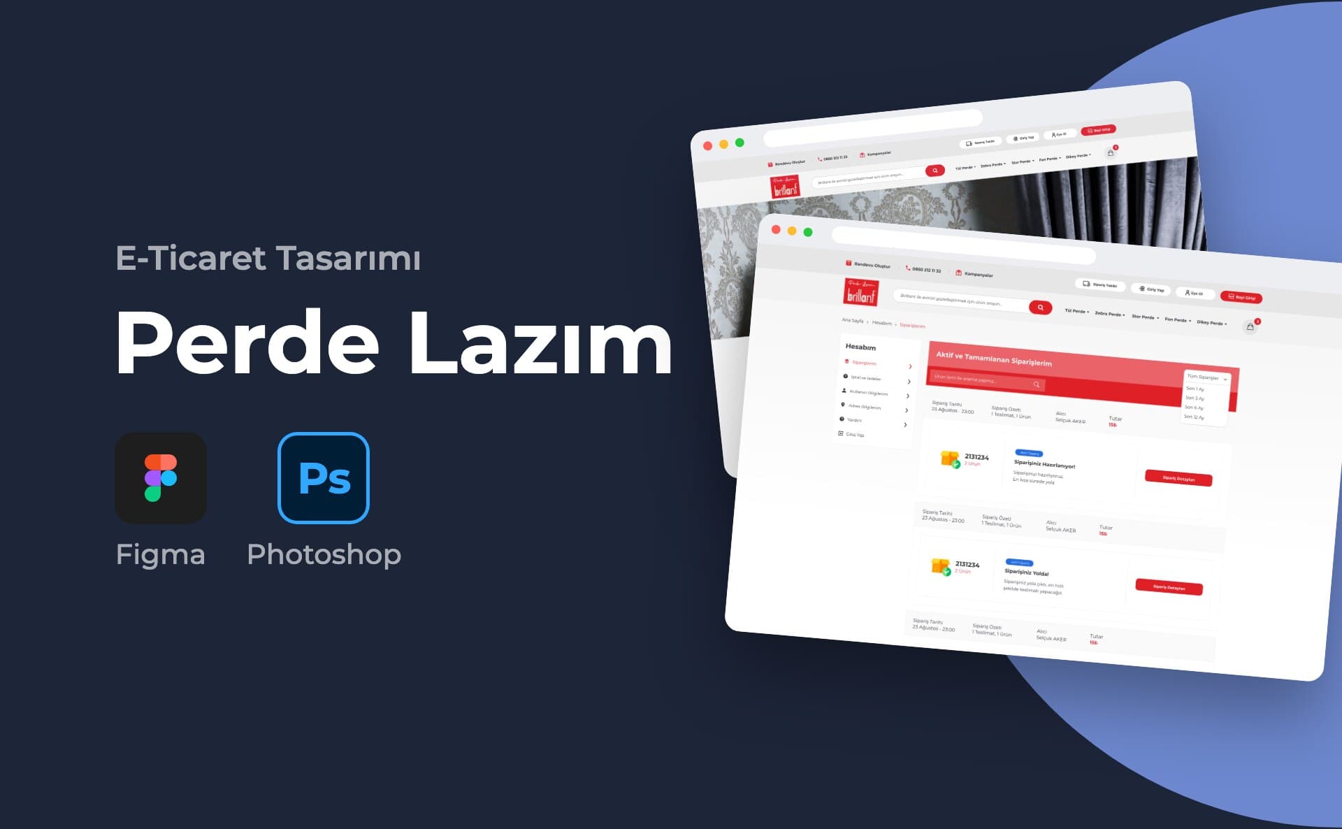
I designed the site's interface. As the cover image also states, I prepared the design in Figma. I used Zeplin for handoff. The cover says 20 screens. This page shows 12 of them:
- My Account: My Orders, My User Details, Cancellation and Return Details
- Cancellation and return flow: cancellation form, return form, return request details
- Help: Help Centre and help content page
- Corporate pages: Blog, About Us, Contact
- Error page
Process and design decisions
I kept the appointment option visible on every page. On the left of the top bar are "Randevu Oluştur" (Book an Appointment), the phone number and campaigns. On the right are order tracking, login and sign-up. "Bayi Girişi" (Dealer Login) stands apart from the rest with a red button.
I gathered the account area into a single left-hand menu. Orders, cancellations and returns, user and address details, and help are all in the same list.
On the order cards I showed status on two levels. At the top is a small label: active or completed order. Below it comes a clear status heading: "Siparişiniz Hazırlanıyor!" (Your order is being prepared!), "Siparişiniz Yolda!" (Your order is on its way!) or "Siparişiniz Teslim Edildi!" (Your order has been delivered!). The list can be filtered by the last 1, 3, 6 and 12 months.
In the order details I split cancellation and return into two separate buttons: "İade et" (Return) and "İptal Et (Sipariş Yola Çıkmadan)" (Cancel, before the order ships). The difference between the two is written on the button itself.
I broke the return process into a short question form. The user indicates whether they have received the product and whether they have handed it to the courier. They then choose the courier company and the reason for the return. In the return request details, the status, shipping information and return code are given prominence. Below them runs the message thread between the customer and the site.
In the Help Centre there are four tabs under the search box. The first tab is dedicated to the question "Neden Randevu Oluşturmalıyım?" (Why should I book an appointment?).
The accent colour is the red from the logo. Buttons, status labels and active menu items use this colour. At the bottom of the page there is a strip with information on payment convenience, a 30-day cancellation guarantee and secure shopping.
Deliverables
- 20-screen desktop interface design in Figma
- Zeplin for developer handoff
- Cover and 12 screen visuals in the portfolio
Outcome
Perdelazim.com was live for a period. The Internet Archive holds captures from between November 2021 and June 2022. The page text in the archive shows parts of the structure from the design:
- Top bar with appointment and dealer login
- The line "resmi satış sitesidir" (is the official sales site)
- Strip for payment, cancellation guarantee and secure shopping
- Footer with Corporate, Categories and Contact Us columns
The menu items and phone number differ from the design. The domain is not live today.
This project is an example of my e-commerce website design service.